Ditto
Ditto is a small, discrete, wearable notification device that lets you know when you get a call, text, email, or an app notification.
Ditto by Simple Matters Logo
The Objective
The Objective for this project was three fold:
Identify Usability issues and points of frustration for users within the Ditto on-boarding process
Identify points of frustration for users in setting up their notifications
Propose and implement solutions to identified issues
The Problem
85% of all calls and emails made to the Simple Matters Support Desk were about on-boarding issues in the Ditto app. While I was working as a tech support team member, I recognized the issues were not technical; they were primarily a usability issue. A good number of those emails also complained about not knowing how to properly set their notifications up for the apps they were using. This resulted in most of the support staff's time invested in an issue that was easy to fix, and increased costs to the company because of the amount of hours needed to help users with these issues.
My Role
For this project I was the main UX Researcher/Analyst. I had one other IT Support coworker to help as my research assistant.
The visual designer and UI designer were responsible for the wire framing and visual design. The team wanted me to focus on finding participants from our core customers, get a better idea of what they were experiencing, and coming up with some solutions to fix those problems.
The Plan
With this, I came up with a plan.
1. Identify our core users and conduct user interviews
2. Find current users and do a contextual analysis of their experience with Ditto (how, where, when, and what they use Ditto for) and establish a baseline for their experiences.
3. Conduct usability studies of the current version of Ditto as well as various prototypes with new users from our identified core user populations
4. Iterate and reiterate prototypes based on the feedback we received.
Ditto's Users
Previous efforts at UX done by marketing and a General Assembly UX Design cohort produced a journey map and some initial personas. While the effort was commendable (the Journey Map was exceptionally good), the personas original personas were inaccurate.
Previously Used Personas


Ditto’s Actual Users
Working as part of the IT Help Desk gave me access to the most reported issues, as well as the people who felt Ditto had the most value to them. My initial instinct was to go to them and find out more about the people who were passionate about our product. I also reached out to our backers on Kickstarter, people who registered their devices on our website, and customers who bought the device on our website.
After conducting my surveys, interviews, and contextual analyses, I was able to identify Ditto's three main users: Deaf/ Hard of hearing, the elderly, and blue collar workers. What was surprising was that although young professionals were buying our device, they were not buying it for themselves. They were buying it for their parents. Also, a good portion of help desk calls were made through a Video Relay Service, which is a service deaf and hard of hearing people use to call hearing people. This pointed to a deficit in knowledge, and thus an inaccurate portrayal of who our actual users were.
My work produced three workable personas: Julie’s mother Abigail, Linda the Deaf User, and Tom the Factory Worker.
The User's Experience
Using the in-person contextual analyses, I was able to verify the Journey Map the General Assembly team put together. Their map closely reflected the experiences our core users had with Ditto and identified the major pain points they experienced throughout that journey.
Critical Take Aways for Future Development
After doing multiple contextual inquiries with our core user groups (5 members of each group) there were things that we really needed to keep in mind moving forward when implementing changes if they were going to be effective.
All Ditto’s main users were people who were lower income AND had limited experience with mobile technology
Two populations in particular (elderly and the Deaf) were largely neglected by tech development despite wanting new tech that would address their needs
All future development on Ditto needed to account for the Deaf and elderly because they combined are the people who made up 70% of Ditto’s user base
The Usability Study Tasks
Now that we identified who our core users were and understood who we were designing for, we could finally tackle our main goal: fix on-boarding issues and setting up notifications.
Set up Ditto with your phone
Change the notification settings for texts and phone calls
Change the notification settings for the Facebook App
The Key Pain Points
Onboarding Issue 1
The “install battery” image links to a video in another app, which frustrated users attempting set up. They had to close the video player, and then navigate back to the Ditto app.
Onboarding Issue 2
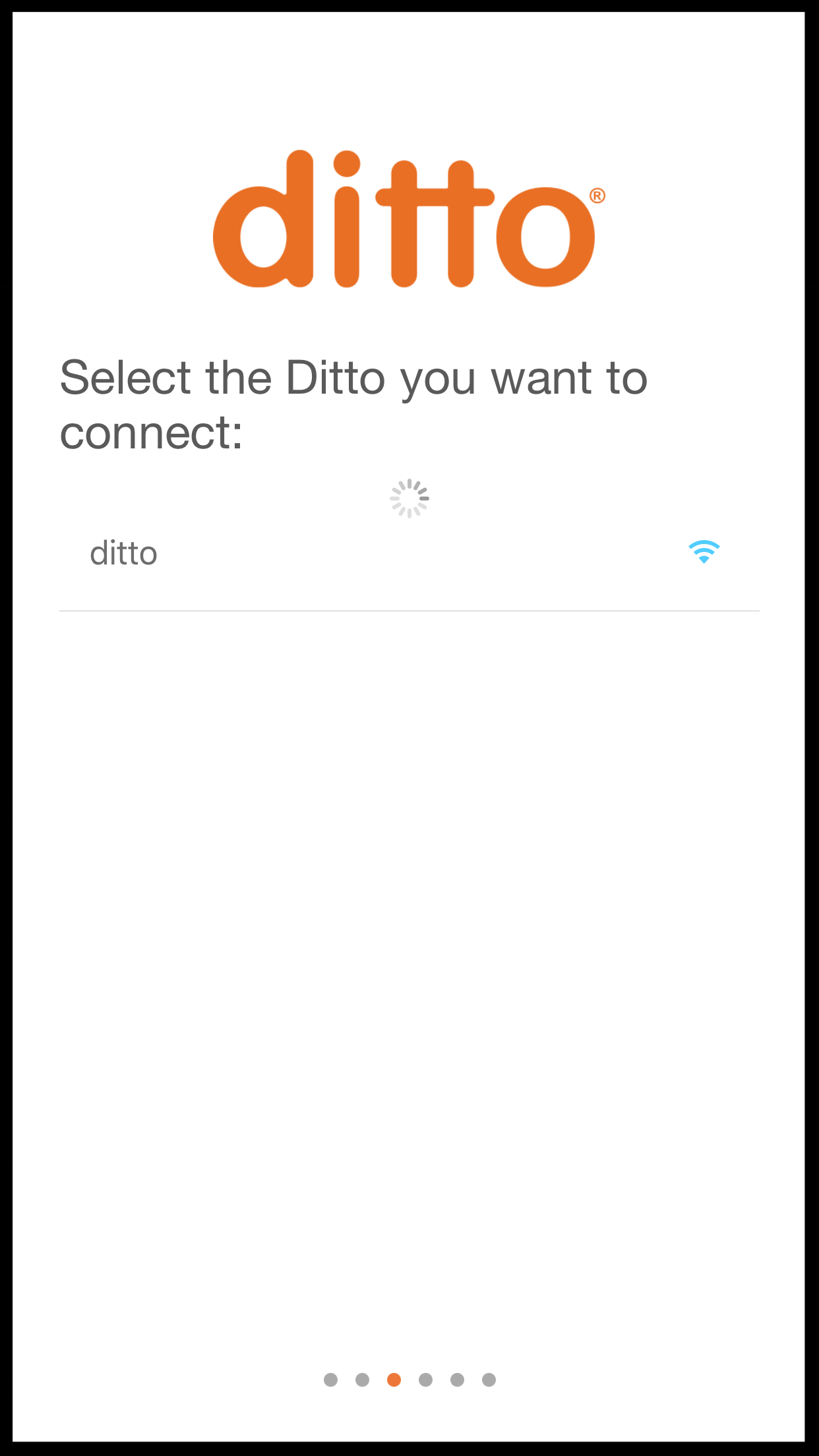
When choosing to connect a Ditto, users were offered non-Ditto devices that would not work with the app.
If there was more than one Ditto in the room, it was not clear which Ditto to connect to.
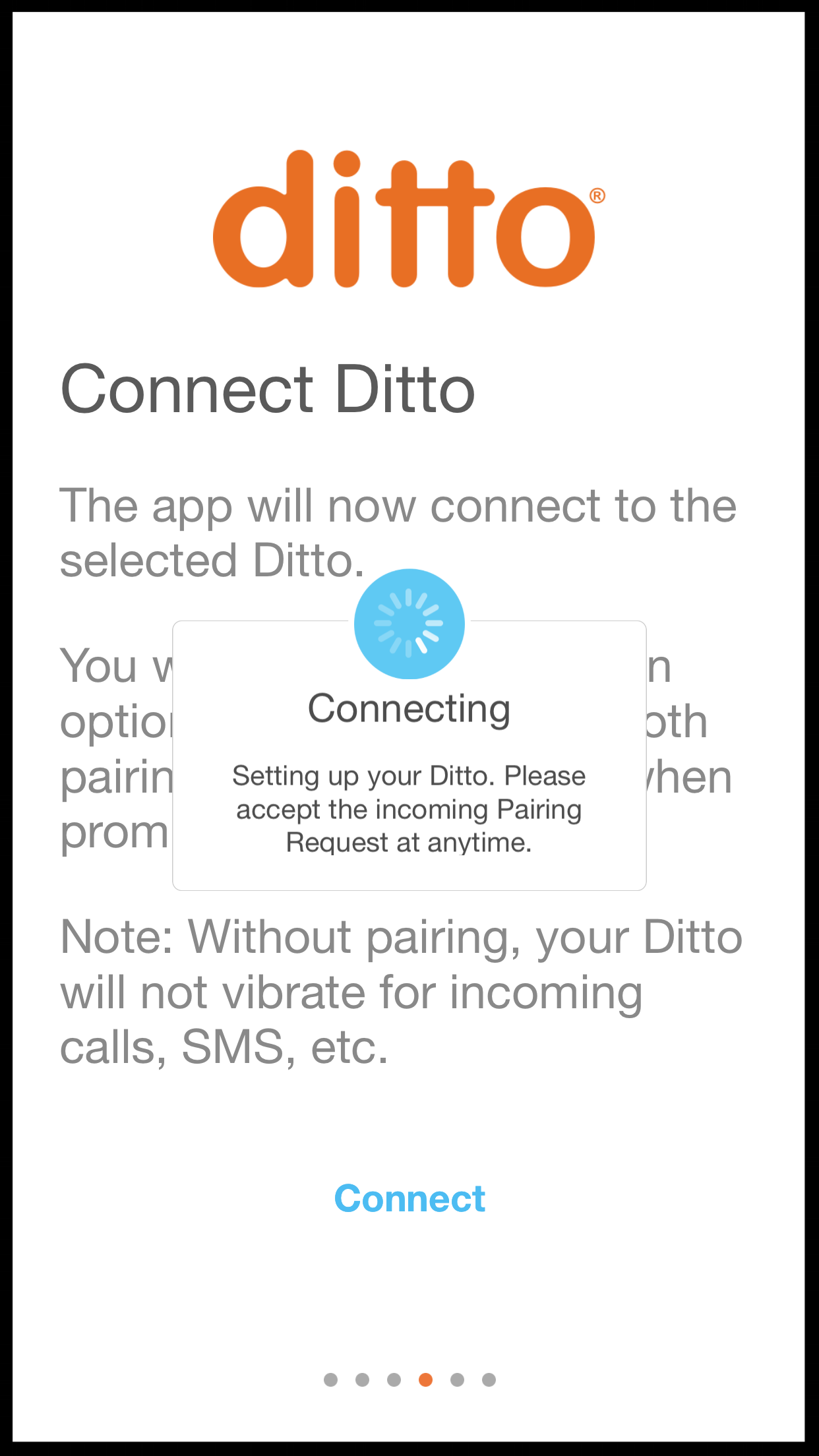
There was also an issue where in the if the user missed the iPhone Bluetooth Pairing request, the device would connect in the app but the user’s iPhone would not connect to the Ditto.
In-App Issue 1
Users did not recognize that “Custom Vibrations” was where their Ditto notifications were set up.
Users did not understand what the “Tether” function was.
In-App Issues 2
Users could not find where to set up their 3rd Party app Notifications and did not notice the “Other Apps” menu.
Solutions
Each solution we tested, prototyped, and implemented focused on the expectations and experiences of our core users. Seeing as nearly 70% of our users matched up with the Linda the Deaf User Persona and Tom the Factory Worker Persona, our designs had to be made for users who were less experienced with mobile technology while still lining up with the expectations of Julie the Professional Persona. This meant we had to guide our relatively inexperienced users, as well as teach them common design language other apps and services used. This was a challenge, but with multiple iterations, we were able to get satisfactory results.
Onboarding Fix 1
We changed the Video into a gif that would not take you away from the Ditto App but kept the “Video” Label so that our older users knew the image would play when tapped.
Onboarding Fix 2
We removed all non-ditto devices from appearing in the menu and added a Signal Strength Indicator so that users knew which ditto was closest to them in case there were multiple dittos in the area. Almost all users tested understood more signal meant the closer the Ditto was.
Ditto Onboarding Fix 3
We added an intermediary message that explicitly notifies users to accept the iPhone Bluetooth Pairing request. This drastically reduced the chance of users missing the pairing request.
Ditto In-App Fix 1
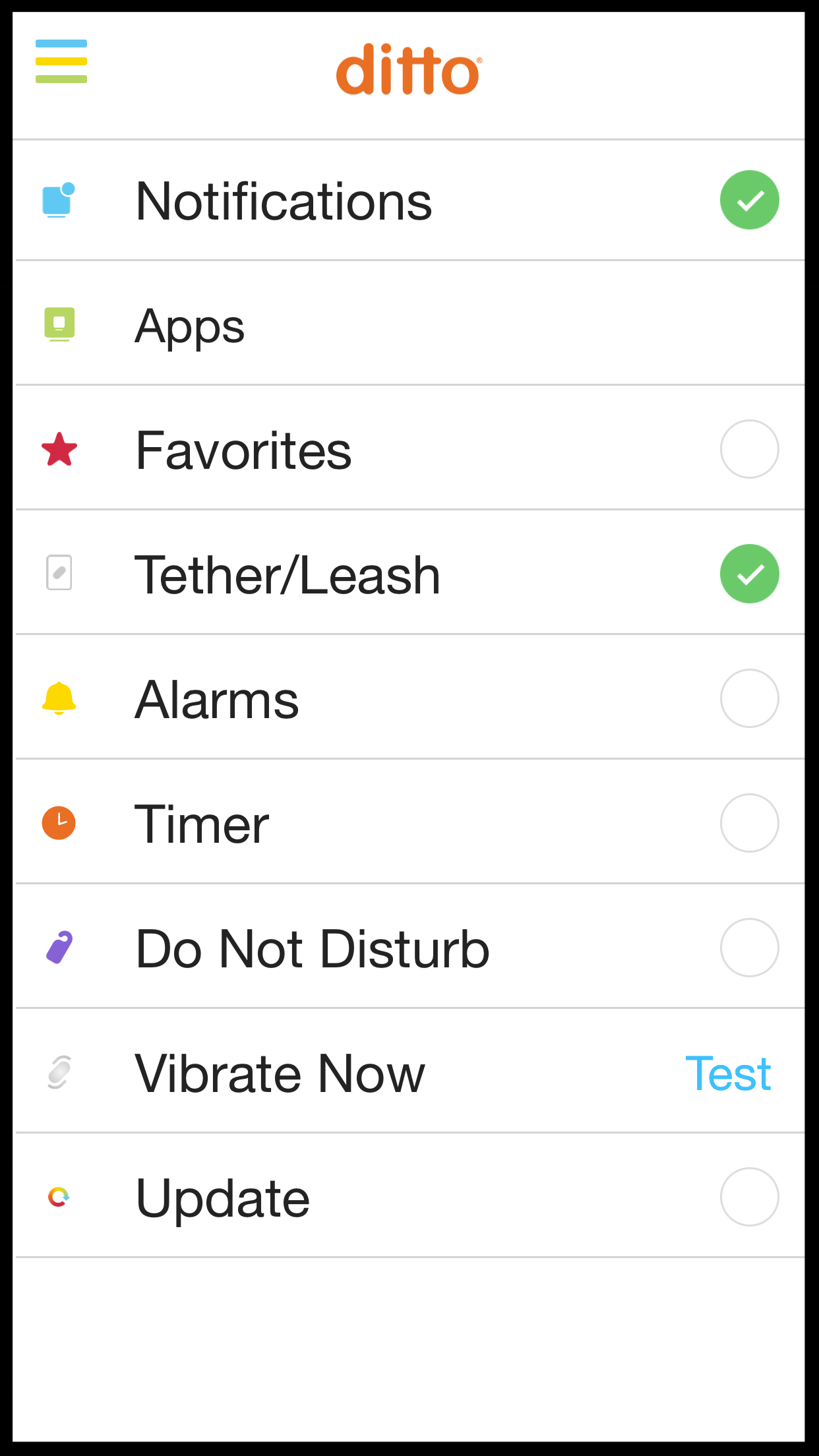
We did a number of fixes on our app's main screen to fix the issues we had.
First, we renamed “Custom Vibrations” to “Notifications” as users seemed to understand Notifications better than Custom vibrations.
Next, we added the “Apps” menu to the home page so Users could access their 3rd Party App notifications easier. New users found this to be easier to discover.
We also renamed “Tether” menu to “Tether/Leash” as all users were divided fairly evenly on whether they understood the idea of Tether function better as “Tether” or as “Leash”.
In-App Fix 2
We also kept the "Other Apps" option in the "Notifications" menu, because we found our original users had trouble finding the menu to change their 3rd Party App notifications when we removed "Other Apps" from the notification menu.
This served as a compromise for both new and old users of Ditto so that both could achieve their main goal: changing their app notifications.
Results
Post implementation of these changes found significant results:
• Onboarding issue reports virtually disappeared
• User adoption rate increased by 45%
• Customer satisfaction with Ditto increased from 85% to 96%
Conclusion
The major changes implemented were highly successful in fixing major usability issues within the Ditto app.
In the end, this short project saved Simple Matters LLC time and money which we then utilized on developing more features that Ditto users wanted. It also resulted in greater satisfaction with Ditto as a whole for its customers. In all, this project for us was absolutely necessary in making Ditto a better product and making it a better experience for everyone involved.


