School Loop
Inspiration
I once was a teacher. My days were spent lesson planning, gathering materials, teaching class, going to meetings, and when the day was over, grading homework and doing more lesson planning. When I started out, the school system I worked in started using an online platform to update grades and connect our schools with the greater school district. I was excited about the prospect; I thought it would streamline things and I wouldn’t need to keep multiple records for my students grades.
I was very wrong. The system we adopted was clunky, hard to use, and confusing. It was district built and not intuitive at all. I hated using it. It was actually a lot slower than keeping track of grades in a physical note book. The school I worked at eventually switched to School Loop which was better but it was still unintuitive, clunky, and had features that were hard to figure out. Worse still, School Loop wasn’t just unintuitive for teachers to use, parents and students often complained about it as well.
It’s been four years since I left teaching and out of curiosity, I wanted to see if School Loop had made improvements. I wondered if, after all this time, School Loop was still unintuitive to use. I then wanted to challenge myself and come up with solutions to those issues.
What is School Loop?
School Loop is a learning management system used primarily by K-12 Educational Institutions. There are four different platforms built specifically for the needs of each user base (Students, Parents, Teachers, and School Administrators). Each platform is tailored specifically to the needs of each user group. The features School Loop has depends on which platform the user is utilizing.
Administrators can access grade books, a site builder, a message system, and a host of communication/scheduling applications to keep in touch with students, parents, and teachers.
Parents and Students have access to grade books, progress reports, calendars, assignments, and messaging systems to keep track of their work and progress.
Teachers have access to grade books, calculators, assignments, calendars, and a host of applications to help with managing their classroom. Some of them range from extremely useful (attendance recording) to extremely limited in use (locker assignments).
Uncovering Issues
I haven’t touched School Loop in over four years so I had little to no knowledge of what the experiences users had with it. Since there were four different platforms, I assumed that each experience and how well people thought they worked would differ depending on which platform was being used. I decided to narrow my focus on to the two platforms used the most: the Teacher platform and the Student platform.
I started conducting user interviews with students and teachers who used School Loop. After 5 interviews with students, it became clear to me that the student platform had less issues (mainly aesthetic) than the teacher platform. Whereas after 5 interviews with teachers, a common theme was starting to develop.
Student Quotes:
Here are some notable quotes from the students I interviewed:
“School Loop is easy enough to use. It isn’t pretty, but it gets the job done. I never spend time looking for what I need to. It’s just there.”
-Gene High School Sophomore
“School Loop is kinda ugly, but other than that, it’s easy to use. I don’t have problems with it at least.”
-Whitney 7th grade
“It gets the job done I guess. I only use it to check grades and my schedule, but that’s easy to do. If I had to say something it would need to improve, it would be that it looks too simple.”
- Lauren High School Senior
Teacher Quotes:
In contrast, here are some notable quotes from the teachers I interviewed:
“I’m used to it by now, but starting out a lot of the features are confusing, even for tech saavy people. We use the gradebook the most at my school, and that’s where a lot of teachers struggle.”
- Ron High School English Teacher
“I don’t even use half the features on the site. I just use School Loop to keep track of my grades. It takes me long enough to get that done. It isn’t as easy as you would think.”
-Beth Middle School Math Teacher
“I’m not good with computers in general. I only use School loop because I have to. If I had it my way, I would submit paper grades. I mean, I tried to learn, but I still have trouble.”
Janis High School History
The Focus
After doing my initial round of user interviews, I decided to focus on fixing School Loop’s teacher platform. The information I got out of the students I interviewed left me with a feeling that whatever changes I could make to make their experience better would be minor. The teachers on the other hand, had much more serious issues with their platform and I felt that my effort would be more worthwhile spent fixing issues users actually had.
With that, I conducted more user interviews and based on those interviews created two main personas that I could focus on while I was creating solutions to the problems these users were facing.
The Users


Setting the Stage
After conducting the interviews, I scheduled time to do a contextual analysis of how these users actually used School Loop. I asked if I could come into their classrooms and have them walk me through their process when they used School Loop. It was important that I got to see when, where, and how they would typically use School Loop.
Their environments were pretty consistent across the board:
- Teachers mainly used School Loop to update grades and post extra materials
- They usually used School Loop in their classrooms, in teacher’s lounges, or their offices (if they had one) while they were on campus and not teaching class
- All teachers used a laptop or a desktop computer while using School Loop
- Teachers stated that they tried to keep grading and School Loop usage confined to times that they were on campus
- In the event they needed to use School Loop off campus or at home, they tried to get that work done as quickly as possible.
Contextual Analysis
After spending some time observing Teachers using School, I started to notice a few things:
- Teachers mainly used School Loop to update grades, make announcements, and post supplementary materials
- 80-90% of their time on School Loop was spent managing their classes’ grade book
- A major reason users were spending a lot of time on their gradebooks was because teachers had issues using the gradebook
With that, I was able to identify, the user’s main goal and what I needed to work on.
Goals and Project Scope
The teachers have one main goal: to quickly, efficiently, and accurately update their gradebook.
As such, my goal was to redesign School Loop’s grade book to achieve three things:
- Reduce the time teachers spend filling out their gradebook
- Reduce the number of steps to update grades
- Reduce the number of mistakes and edits teachers make while
By doing these three things, I would in effect help teachers achieve their main goal.
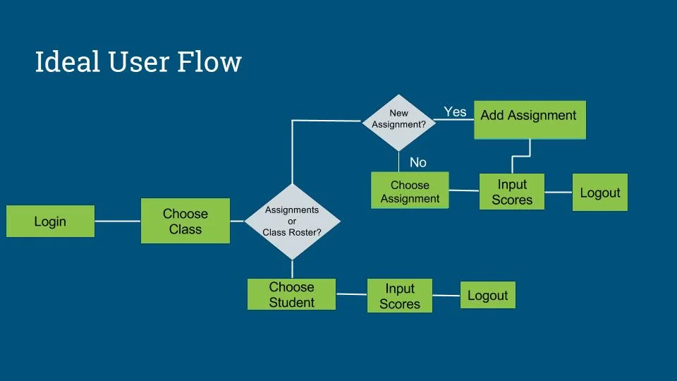
With that in mind, I needed to identify identify what the ideal user flow would be for them, as well as the pain points that obstructed them from that goal.
This user flow is the most ideal:
Simple, straightforward, and free from unnecessary complications.
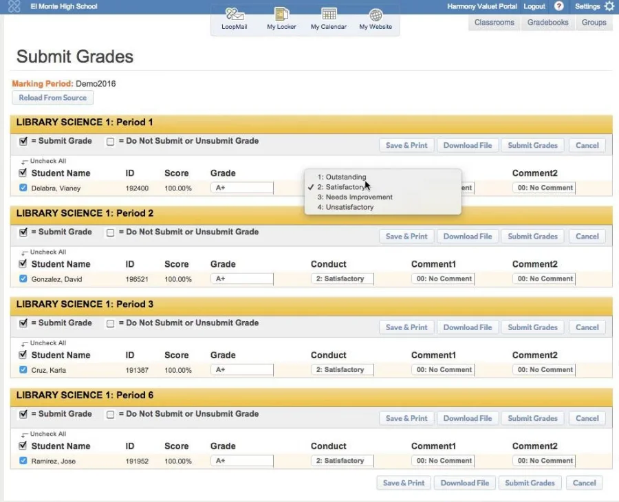
Unfortunately, the way the current platform is setup introduces quite a few roadblocks to making that possible.
This user flow is the most ideal:
Simple, straightforward, and free from unnecessary complications.
Unfortunately, the way the current platform is setup introduces quite a few roadblocks to making that possible.
Key Pain Points
Issue 1
The amount of information on screen was overwhelming and users would often lose their place when entering multiple grades
Issue 2
Users could not officially submit more than one student’s grades at a time, which meant individually approving every student’s grades one at a time
Issue 3
≠
≠
Saving, submitting, and publishing grades are all separate functions, resulting in teachers often making the mistake of doing one of these things when they meant to do all of these things
The Initial Prototype
The goal of my initial prototype was to focus and simplify the experience as much as I could. I was successful in that regard, but there were several shortcomings.
All the teachers tested thought first to choose the class they needed to input grades for, not management options first.
Teachers felt annoyed that choosing gradebook gave them options instead of a view of the gradebook.
Teachers also wanted to manage their classes from a single page instead going through multiple screens
Minimum Viable Prototype
The feedback given from the initial prototype had me strive to balance focusing the experience with being able to conveniently view multiple kinds of information at once.
One of the big issues I was trying to combat was simplifying the steps and the information, but users wanted and needed to have multiple pieces of information visible.
This created a challenge where I had to balance showing enough information without inducing cognitive overload.


After multiple iterations, I managed to produce a Minimal Viable Product that tested well and managed to be both simpler and detailed enough for teacher usage.
Now all I had to do was take this and create a High Fidelity Prototype.
The Final Prototype
I took the feedback I received from my MVP Prototype to heart. The main thing I gathered was that users really liked having all the menus in the same page and not having to navigate away from their core management pages.Being able to hide them at will also gave them the freedom to look at multiple panes when they needed to, and closed them when they were done.
The gallery below will show annotated screen shots of the final design.
If you would like to check the prototype out for yourself, you can so by clicking the link below.
Do note that the prototype was meant to work on a desktop/laptop and not for mobile devices as no teacher uses a mobile device to access School Loop.
http://qw06r7.axshare.com/#c=2


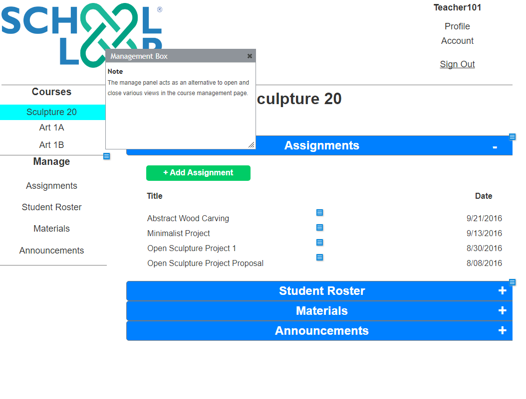


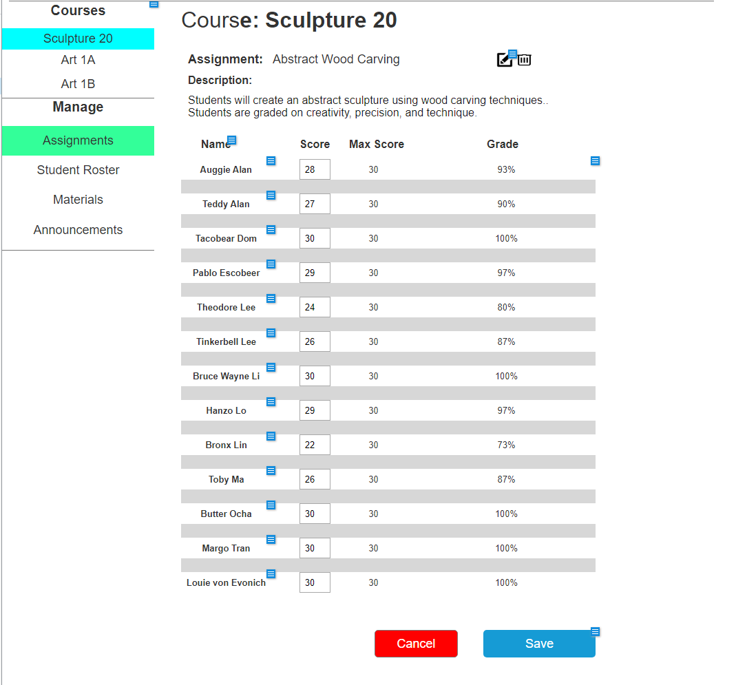
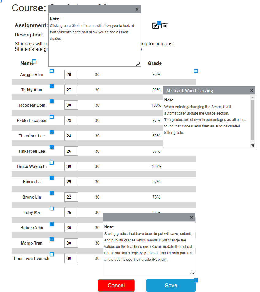
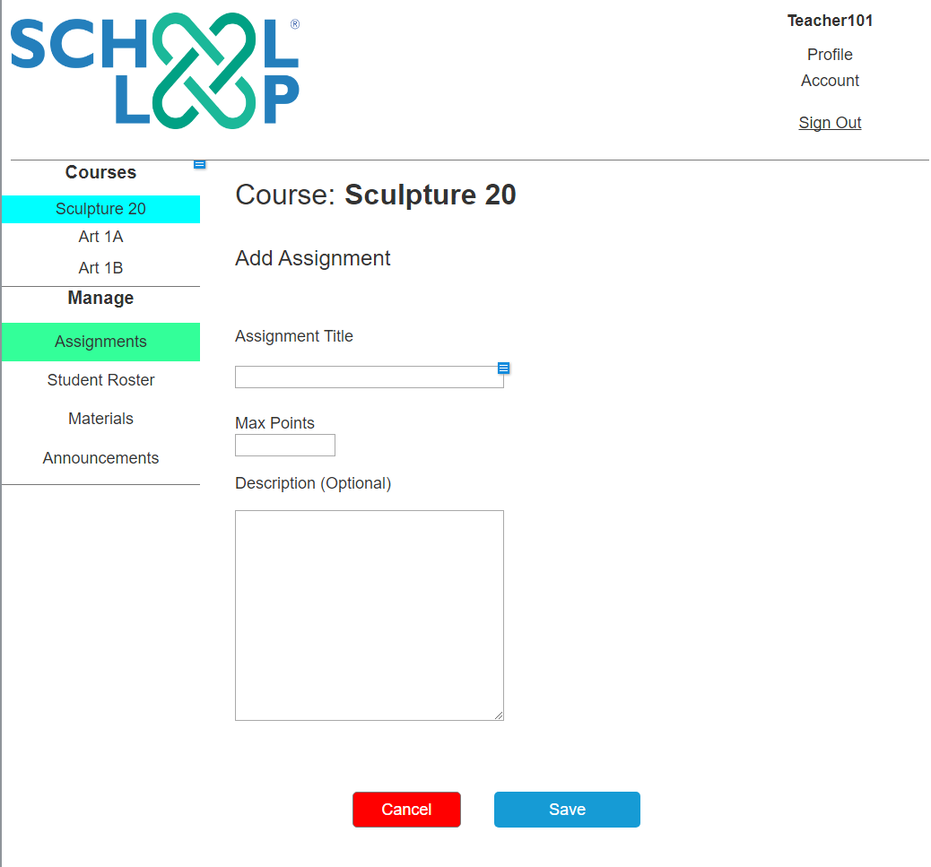
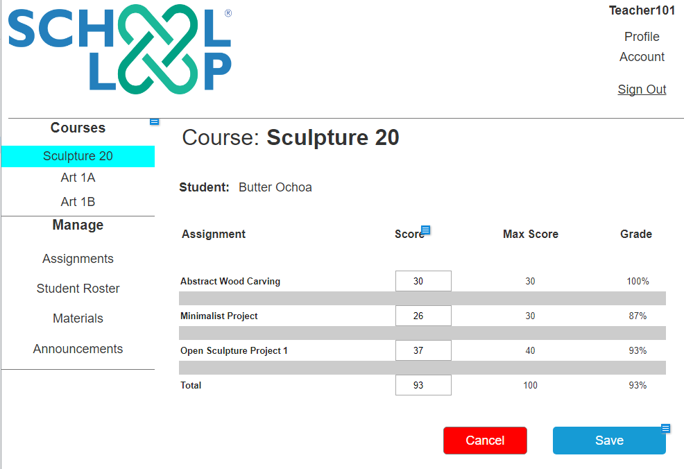

Overall, test users liked the newer design’s focused approach to their gradebook and felt it was easier and more straightforward to use.
Being able to see various views of their classes’ information was a huge plus and they no longer had to waste time doing three different tasks just to save grades.
However, there are a few features that teachers wanted that I did not have time to implement.
Next Steps
The next features to implement are the features that would greatly help teachers manage their gradebook, but are not necessary to completing them.
- Weighting grades for assignments
- Setting grade curves
- Statistics and overviews of student, class, and assignment progress
Conclusion
Teachers really liked the more focused views and prefer it over a sprawling Excel-sheet like form. With these changes teachers will have a more enjoyable experience, make less mistakes, and get their grading done faster.
There is still more work to do, and but with continued dedication to building a focused, deep, yet simple system, teachers will not only get their job done faster, but it will become an enjoyable experience for them.


