Give and Take
In 2013 the Exploratorium in San Francisco opened up in their new home on Pier 15. During that time period, a new set of Exhibits themed around “The Science of Sharing” were developed and made their debut a year later. All of the exhibits focused on the Social-Psychological phenomena of sharing resources, ideas, and cooperation with others.
This is the story of how one exhibit from that collection brought strangers together. This is the story of the Give and Take Table.
The Exploratorium
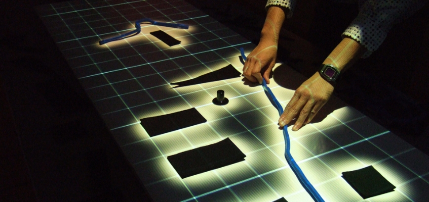
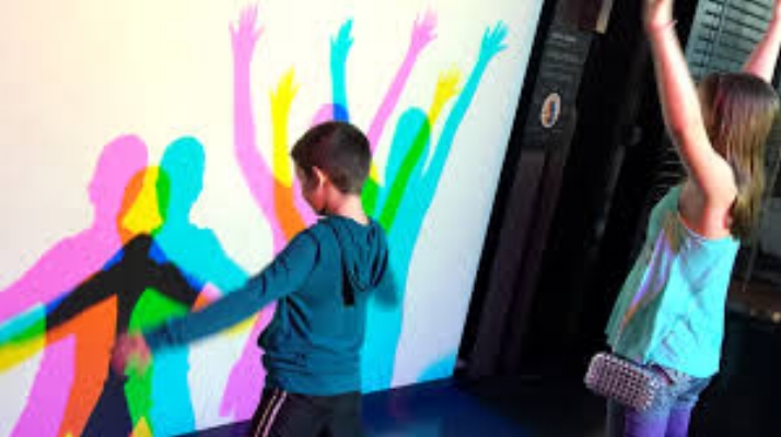
The Exploratorium is a science museum based on hands-on learning. Frank Oppenheimer, one of the leading scientists in the Manhattan project, believed that people did not understand science because books and traditional education abstracted the ideas and thus alienated people. He felt that if people were able to see scientific phenomenon happen, they would understand it, and with that understanding, better contribute to their communities. He then created a museum that allowed people to witness scientific phenomena and allow people to be part of the scientific process.
Since Frank was a Physicist, most of the iconic exhibits are physics based, and are based around physical phenomena. In it's 46 year history, it has also come to incorporate exhibits on math, biology, astronomy, ecology, geology, and most recently the social sciences focusing primarily on psychology and sociology.



The Task
Design and create an exhibit that showcases the phenomena of people utilizing a collective commons space (a space open to all for others to contribute/take from) in general tend to be equitable even without direct supervision.
The Give and Take Table also had to meet the following criteria:
• It must be interactive
•Visitors must on average interact with the exhibit for longer than 10 seconds (stretch goal 60 seconds)
•It must be clear to the visitor that they are supposed to give something and take something else in return
My Role
Since I was the most experienced person in doing ethnographies and conducting user testing, I was the main person in charge of interviewing visitors and observing how they interacted with the exhibit. My main duties were as follows:
Gather and deliver Qualitative Feedback from visitors and suggestions on how to improve that experience
Identify issues with prototypes on the floor related to visitor interactions
Provide suggestions and feedback for new iterations of the Give and Take Table
Target Audience
Not every exhibit is made with everyone in mind. In general, the Exploratorium tries to create exhibits that have a broad appeal through the phenomena alone, but since this is a socially focused exhibit, we needed to have a broad appeal, while still being focused enough that we get people to interact with it.
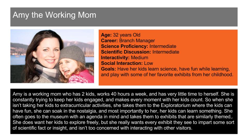
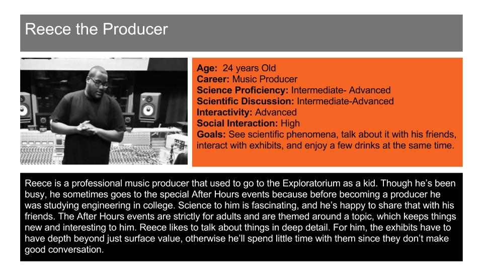
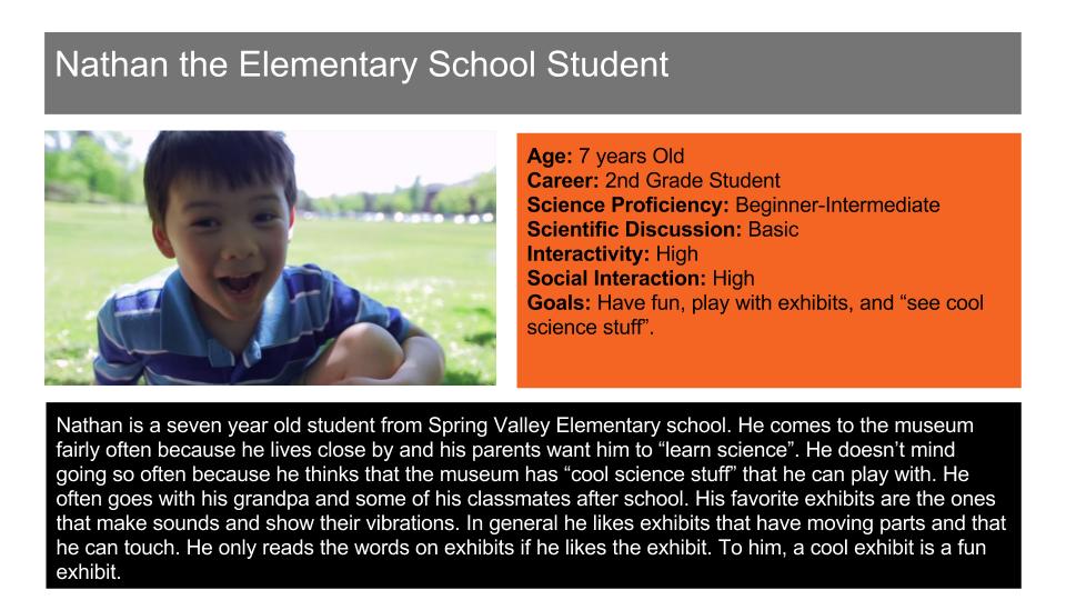
For the Give and Take table, we were told to keep these four demographics in mind:
•Parents
•Teenagers
•Young Children (6-10 years old)
•After hours adults (adults who go to the Exploratorium during Adults only hours)

Commonalities
After extensive talks with visitors, as well as interacting with them, despite their wide age range, they had quite a few commonalities:
Expectations:
• Expect exhibits to be interactive in some form (visually, aurally, and/or tacitly)
• Expect the exhibit to be up front and showcase its phenomena at first glance, or if it is an unfolding discovery exhibit, that something surprising happens after an extended interaction
• Visitors don’t want a lengthy explanation before interacting with an exhibit
Reasons for Visiting:
• Visitors in general came because they wanted to see “cool science stuff”
• Visitors want to see science in action and not have someone tell it to them
• Visitors want to be surprised
• Visitors come specifically to the Exploratorium to “do science” or to “make science happen”
• Parents, After hours adults, and Teenagers come to the Exploratorium because they remembered it being fun as a kid, and because it feels nostalgic
Synthesizing the Research
Now that we’ve essentially figured out the what motivates our target audiences, we needed to take that information and implement it into our designs.
So from there we revised the requirements of our exhibit to meet the goals we set:
• It must be interactive
•Visitors must on average interact with the exhibit for longer than 10 seconds (stretch goal 60 seconds)
•It must be clear to the visitor that they are supposed to give something and take something else in return
• The exhibit needs to stand out visually and be inviting
•The interactivity of the exhibit must be made obvious to draw in both children and adults
•Signage and signifiers must communicate the idea of the exhibit from a far
•The exhibit must invite social interaction, both directly and indirectly
Environmental Design
The biggest challenge in this exhibit is drawing visitors to it in a loud, flashy, open space. The Exhibit and it’s concepts are quiet and abstract. It requires visitors to contemplate more than other exhibits, and asks the visitor to participate in giving and taking from a shared space.
Thus, we had to make a relatively quiet exhibit noticeable and engaging without relying on the objects in/on the table. The exhibit needed to independently stand out without any objects in it because sometimes the objects placed in/on the table would be small and hard to see from a far. There are two ways to do this: to make the exhibit to be extremely extravagant or to create an exhibit so simple it draws attention to itself away from the flashier looking exhibits.


Prototype 1
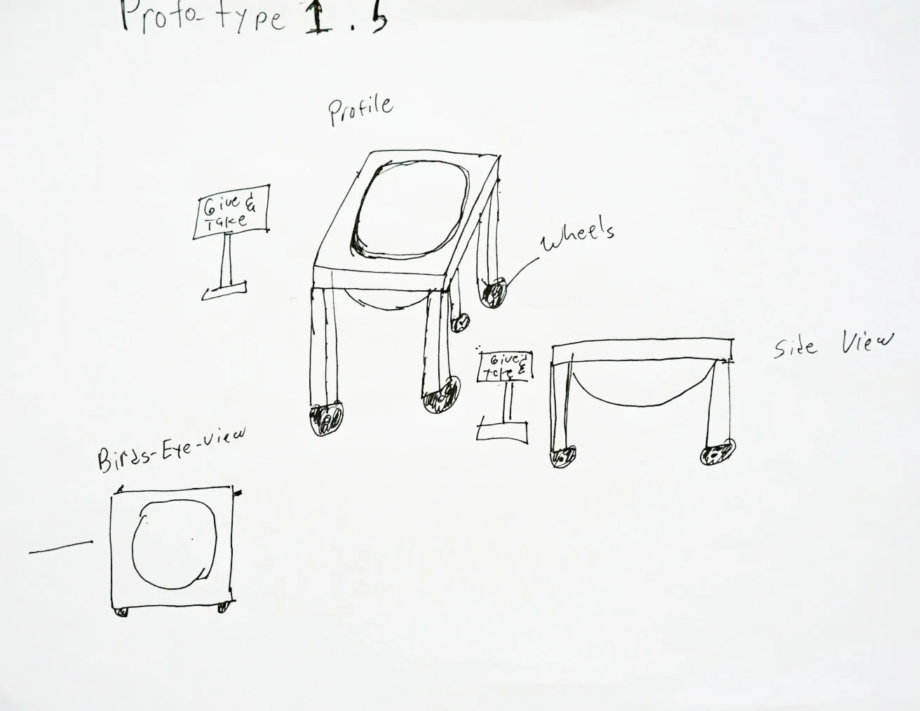
After showing our concept drawings to exhibit developers and visitors, we decided to go with the design they all reacted favorably to: a simple table with a sign next to it that said “Give and Take Table” along with “Give and Take Table” on it’s surface. As with all prototypes we made, I don't have pictures of the actual prototype, but I do have drawings of their designs.
Almost immediately after putting our first prototype on the floor, we started encountering issues.
The biggest of these issues were items falling off of the table. Sometimes, the items could withstand the fall, but after a few broken mugs and nostalgic figurines, the glass clean up was becoming a safety issue.
On top of that, the exhibit visually was too plain and and somewhat uninviting. It was not utilized much despite being placed in high traffic areas of the museum. People simply passed by it. It didn't help that throughout this process, we tried to move the exhibit to different spots after a few days of observation, and moving it was difficult. We had to make some major changes.
Prototype 1.5
We started thinking up new visual cues that would hold items better that were placed in it, as well as be more inviting to visitors. We then came up with three different table ideas: the box table, the bowl table, and the cylinder. We quickly sided against the cylinder since cylinders from our experience were difficult to clean, and also difficult to add and remove items from. We were left with the bowl table and box table designs. We showed these paper drawings to our visitors and people mistook the box table design for a broken speaker, thus we went with the bowl table design.
We used the same table from Prototype 1 to make Prototype 1.5. We cut a hole in the middle of the table and then fit a large plastic bowl in the hole. Used some culping to glue it together, and installed dolly wheels in the legs to make it easier to move. We unfortunately no longer had signage on the table, and needed to rely on floor signage to get the message across. Doing all this, we hoped to address the issues with Prototype 1:
The Table will now stand out due to it’s somewhat abnormal, yet pleasing construction.
Items placed on the table would not fall out on the floor
With added wheels, it would be easier to move the exhibit in case it needed to be moved elsewhere
There was at first, signs of improvement. More people started to notice the exhibit and even interacted with it! But that did not necessarily mean they always got the right idea...
We were successful in getting people to interact with the exhibit more. The more people interacted with it, the more it attracted visitors, which encouraged those visitors to interact with the exhibit.It was a positive feedback loop and we were pretty happy with it. Also, after the design change, the problem we had with items falling out and on the floor also stopped happening entire.
However, new unforeseen issues started cropping up. The first of which was that nearly 30% of all visitors who saw the exhibit thought it was an odd Exploratorium version of a lost and found. This resulted in a number of valuable items ending up in the table that should not have been there. Thankfully, since people generally respected the space, those items weren't taken by random strangers. That however was not acceptable for us and we needed to come up with ways to show that this was not, in fact, a lost and found. When we asked the visitors why they thought the table was a lost and found instead of an exhibit, the main response we got was that "It doesn't look like an Exploratorium exhibit. It has a strange Exploratorium look, but it doesn't have the Exploritorium exhibit feel."
Another issue we also dealt with was that after a month, the prototype had started to look a little worn, and as such, people started using it like it was a trashcan. Thus, with this feedback in mind, we went back to the drawing board.
Prototype 2.0
The Exploratorium Feel
As with anything, fixing one problem brought to light more issues that we could not forsee. We needed to make it clear that the Give and Take Table was not the lost and found, prevent people from using it as a trash can, make it more clear what visitors were supposed to use the table for, and give it a more “Exploratorium-y feel.”
But before we could tackle these issues, we need to unpack what visitors meant by “Exploratium-y feel”. The Exploratorium has a reputation for being fun, interactive, innovative, and creative when showing off scientific phenomena. It’s look and feel is best described as both creative, yet simple. Something too complex looking, or something extremely flat and simple are the antithesis to the Exploratorium look. Here are a few examples featuring the Bernoulli Blower, the Gravity Well, and the Smoke Rings:

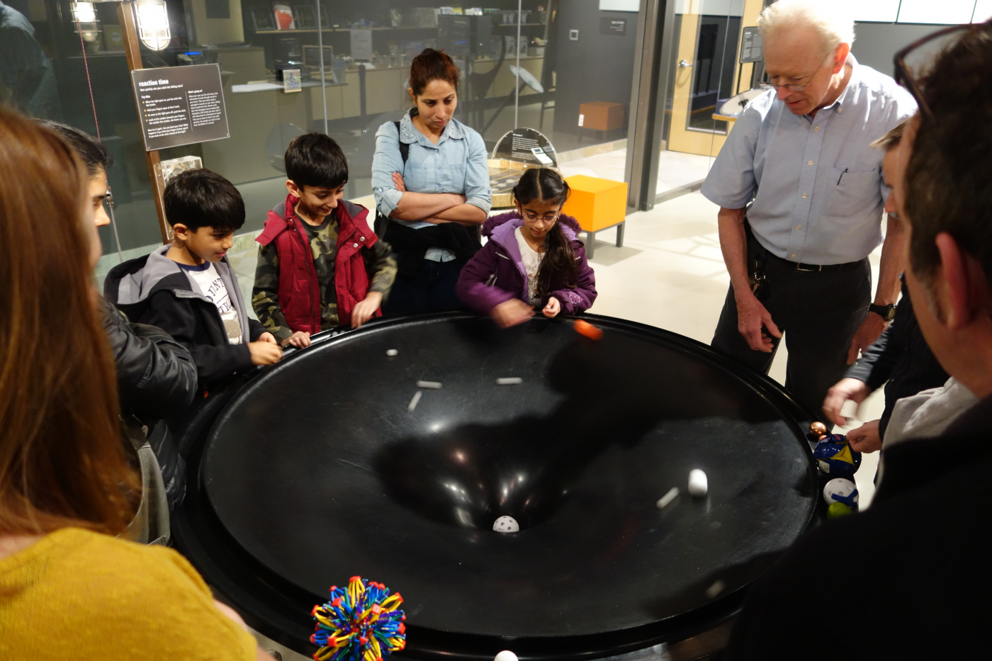

Each of these exhibits have a simple look that hides a surprise within. Despite their simplicity, they are also a little odd looking and enticing. We wanted to do something similar to this and create a simple looking solution to solve our issues.
In the meantime, other Science of Sharing exhibits were being developed, and they had started to all develop an aesthetic. Luckily for us, this helped give us some guidelines to take our next prototype.


Table 2.0
And thus table 2.0 was born. We took a larger square table, replaced the top with a white board surface, got a bowl roughly the same size as the original bowl, and fit that in the middle. There was 6 inches of space between the edge of the table and the rim of the bowl on all sides, with which Explainers (floor educators like us) could draw on to help communicate the idea of what the Give and Take Table was. The other Science of Sharing Exhibits utilized white space, some even utilized white board surfaces, and we thought that was a cool and easy to implement aesthetic
At first it was a resounding success. Explainers, and on occasion visitors, got creative in how they were communicating their ideas of sharing, and what other people had done at the exhibit. Over time however, we started to see an old problem resurface.
The table had started to become dirty. The whiteboard surface unfortunately stained, and after a while, no amount of scrubbing or toothpaste could remove the stains that started accumulating from multiple drawings. However, there was a lot that we got right with this iteration, and we also gained some incredible insight in the long-term life of the exhibit.
Improvements:
More people understood what the exhibit was and how to participate in it, including non-English speaking visitors!
Drastically reduced (at first) trash being thrown in the exhibit, and people stopped seeing it as the Lost and Found
Visitors felt this design was more creative and in the spirit of the Exploratorium
Drawbacks:
The white board stained easily and made the table look grimy
The worse the table looked, the worse people treated it
The exhibit did not have longevity. After a month and a half, the table had started to show signs of wear and tear
We arrived at an incredibly important insight:
The more important the exhibit looked, the better visitors treated it.
We were successful in creating an exhibit people liked, enjoyed, and understood across age groups. Now we just needed a redesign that implemented all that we had learned in terms of signifiers that showed what the exhibit was about, while still making it feel approachable, important, and required minimal maintenance.
The Final Table
Proposed Designs
Since this was going to be our final iteration of the project barring us not meeting our goals, we decided to get creative with all that we learned and put out ideas that incorporated all the knowledge we had learned at this point, show those designs to all the relevant stake holders and visitors, and submit the our proposals to the exhibit makers. Here are some of designs that received the most favorable response:
Eventually, we decided to take the best ideas offered from each proposed design, and implement it into the final product. We decided against any lights as that would require the table be constantly near a power source and would remove our ability to be flexible with its placement. We also opted to do a pedestal shaped base and brought the bowl on top instead of embeded in the pedestal to emphasize the bowl’s importance as well as make the exhibit look important as pedestals are almost universal in signifying importance.
This also allowed us to build cabinets into the base so that in case the bowl needed to be seeded (due to cleaning or because items in the bowl cannot be seen from afar, ) the items we used to seed them would not be far from the exhibit.
The Pedestal also keeps the wheels hidden so that unscrupulous visitors won't know that the exhibit can be easily moved. On the pedestal's sides near the top, we added four placards that each display a different piece of information. Three of those placards displayed information that cannot be changed. One of the placards was a lockable see-through case that could fit an 8 1/2"x 11" sheet of paper with signage/artwork made by an Explainer. This was done so that it would retain some of the creativity from prototype 2.0 that allowed Explainers to communicate with non-English speakers and younger children without leaving behind permanent stains that could potentially tarnish the exhibit. Aside from the see-through placard, the other three placards contained the following information:
The name of the Exhibit (The Give and Take Table)
A "What's Going On?" Table that is standard for all exhibits. It gives a brief description of the phenomenon the exhibit attempts to showcase.
A tablet with probing questions for visitors to think about
What resulted was this:
Floor Life
Post it's final debut, we continued to monitor the Give and Take Table to see if what we created really did what it was supposed to do. For the most part, the signage, features that signified importance and interaction, as well as the overall interactions of the exhibit with other visitors, the exhibit had met all it's goals:
Visitors interacted with the exhibit for more than 60 seconds on average
Visitors were discussing the ideas the exhibit showcased
95% of all visitors who interacted with the exhibit understood to put something in the bowl before taking something from the bowl, even if the giving and taking was not entirely equitable
The exhibit lasted over 6 months without degrading in appearance with minimal maintenance (i.e. daily wiping down of exhibit and no part replacements)
Though we could not prevent people from treating the exhibit as a lost and found or as a trashcan entirely, reducing it to an extremely rare occurrence was a victory for us. On average, roughly 2,500 people visit the museum every day. Having to check for trash or lost items in the exhibit once every 2-3 weeks felt like a huge success.
Unsurprisingly, our target demographics really enjoyed the exhibit. After Hours Adults really liked the social aspect of the exhibit and it became a center piece for many conversations and discussions. In particular, it was interesting to watch when someone deliberately tried to violate the social norm of respecting the exhibit and watching the visitors' reaction to this violation. It was not at all passive, and the norm violator always walked away in shame. After Hours Adults were the most vocal in defending the exhibit, followed by teenagers. Teenagers used the exhibit to correct their friends via social shaming, calling out the jerks among their friends who would steal from the exhibit, or try to cheat the rules by placing objects of negligible worth into the exhibit while taking something perceived to be valuable. Parents used the exhibit to talk about sharing with other people in a broader community. What was surprising however, was the success we had with school children.
An Unexpected Success
Our target demographic of children ages 6-10 years of age did respond well to the exhibit, and understood the importance of having a space that people could freely contribute to as well as take from if needed. What we did not expect was that children from the ages of 3-5 years old would like the exhibit. The exhibit was taller than they were, most of them could not read yet, and we thought that the concept of a shared space for community objects would be too advanced for them. What we did not account for was their desire to be just like the big kids. Most of the children whom expressed interest in the Give and Take Table saw an older kid interact with the exhibit and asked their accompanying adult what that older kid was doing.
Most parents and teachers took this as an opportunity to talk about sharing and asking if the child would like to participate as well. This happened daily and we found that younger kids, though not able to understand the complexities of the phenomena, understood why something like the Give and Take Table was a cool idea. Once they knew what was happening, they wanted in. Though they didn't quite understand the value of certain objects, they did try to match what they gave to what they took according to what they felt was valuable. One child even tried to exchange his mother's phone for a sweet dino plushie.
Sharing is something that all humans do and is largely universal in every culture. It is that spirit of sharing in a community that we had hoped to convey with this exhibit. In the Give and Take Table, we had succeeded in creating a much more universal exhibit than we had thought and we couldn't be prouder.


